READ TIME: 3 MINS
Gilles Deléris, W Conran Design’s Co-Founder and Creative Director, and Anaïs Guillemané Mootoosamy, Strategy Managing Director, reflect on what it took to create the ‘Look of the Games’ for Paris 2024 – and how it felt seeing the landmarks and streets of Paris adorned with their joyous, celebratory visual identity.
Tell us about creating the ‘Look of the Games’ for Paris 2024, as well as the event’s pictograms and now world-famous mascot. Quite the project!
Gilles Deléris: It was a dream job that lasted four years, culminating this summer in Paris and across more than 40 sites in France. We enjoyed every moment and even more so when we saw all the work beautifully displayed in Paris – in train stations, airports and stadiums. For a designer, it’s a unique once-in-a-century opportunity, and brings with it an enormous sense of pride and satisfaction.
And how did you approach the task of creating the ‘Look of the Games’?
Anaïs Guillemané Mootoosamy: Our intention was threefold. We needed to embrace the societal role of the Games and celebrate the Parisian legacy of the 1924 event while propelling Paris into the 21st century. This was about embracing a once-in-a-lifetime opportunity to say something new about Paris and France to the whole world – or at least to one out of every two people watching.
Gilles: We relied on the idea of what defines Paris and France – its heritage and DNA – while freeing ourselves from it to imagine something unprecedented. The Olympic Committee wanted to break the mould in every way – in terms of the environment, creativity and inclusivity. This was true for the opening ceremonies as well as everything we implemented.
So how did you achieve this?
Anaïs: Everything we created for Paris 2024 was built around a simple idea – ‘Games Wide Open’. The tagline signalled that the 2024 Games would address new audiences, set inclusion and openness as the ‘north star’, and invite the world to take part in this once-in-a-lifetime event. Put simply, we wanted to make sure that Paris was a party where everyone felt welcome! This has been embedded into everything we’ve done.
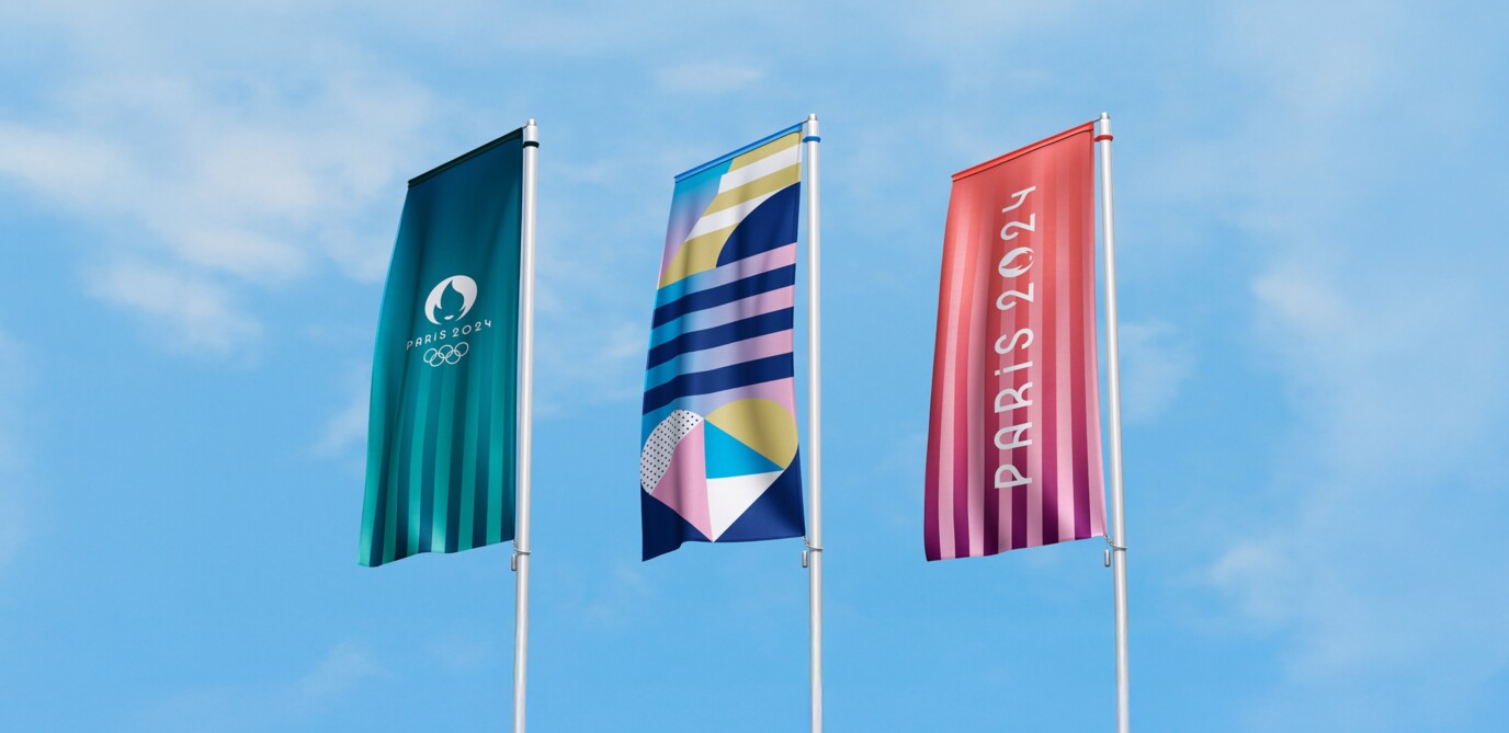
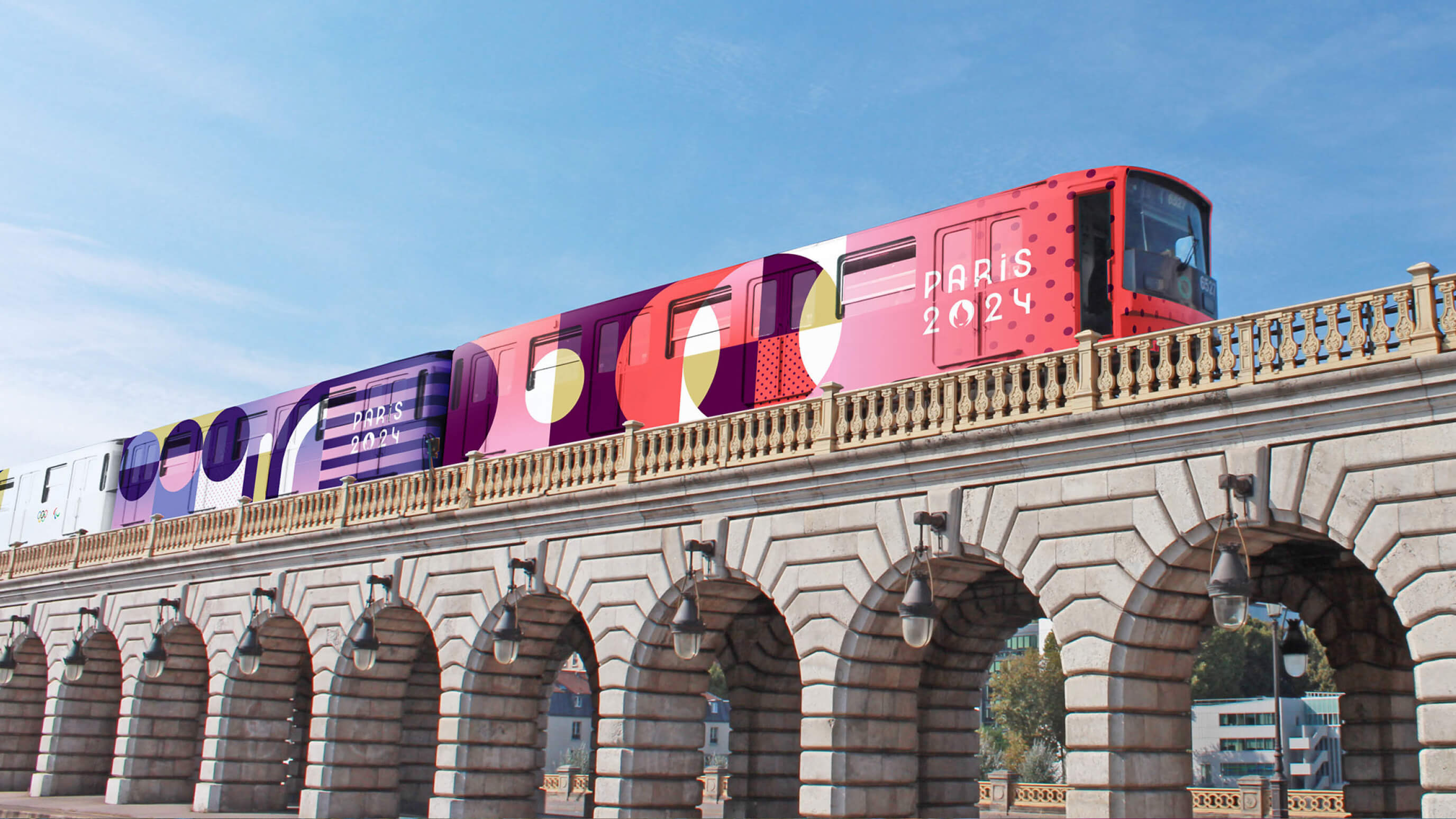
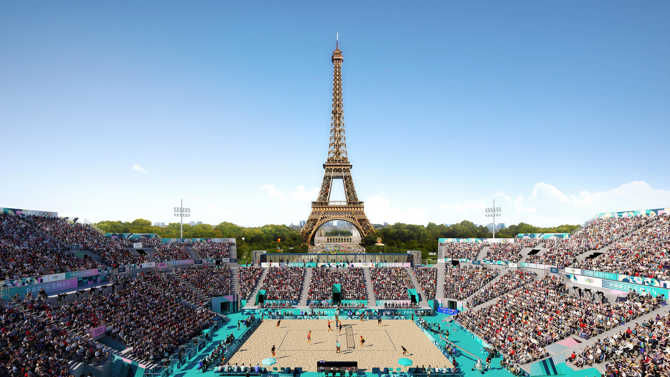
Gilles: Beyond the slogan, the visual identity incorporates symbols inspired by heraldry and celebrates the unity of supporters, Olympians and Paralympians. Inspired by Orphism, it’s designed to adapt to the original context of the Games taking place in the heart of Paris. It’s fully modular and includes symbolic representations of iconic monuments and Olympic sports.
We also wanted a colour palette that didn’t conflict with the mineral tones and splendour of Paris. Pink emerged as the strong marker for the signage system, and the Stade de France has been revamped with a lavender track, referencing, like all the other colours, markers of French identity.
It must have been quite incredible to see the brand adorn the streets and landmarks of Paris…
Anaïs: It really was! And for the first time in the Games’ history, the identity provided a creative sandbox that allowed all stakeholders (sponsors, host cities, venues) to engage with and personalise the design. This meant they could create visual elements using our coherent visual grammar, ensuring each element resonated with its unique context. The whole country was transformed into a unified but diverse party – and in this way, we didn’t push solely the traditional or stereotypical French postcard but crafted a strong visual identity for everyone to play with. Democratised design in practice!
And what about mascot Phryge, which the New York Times described as “the hottest-selling item in town”?
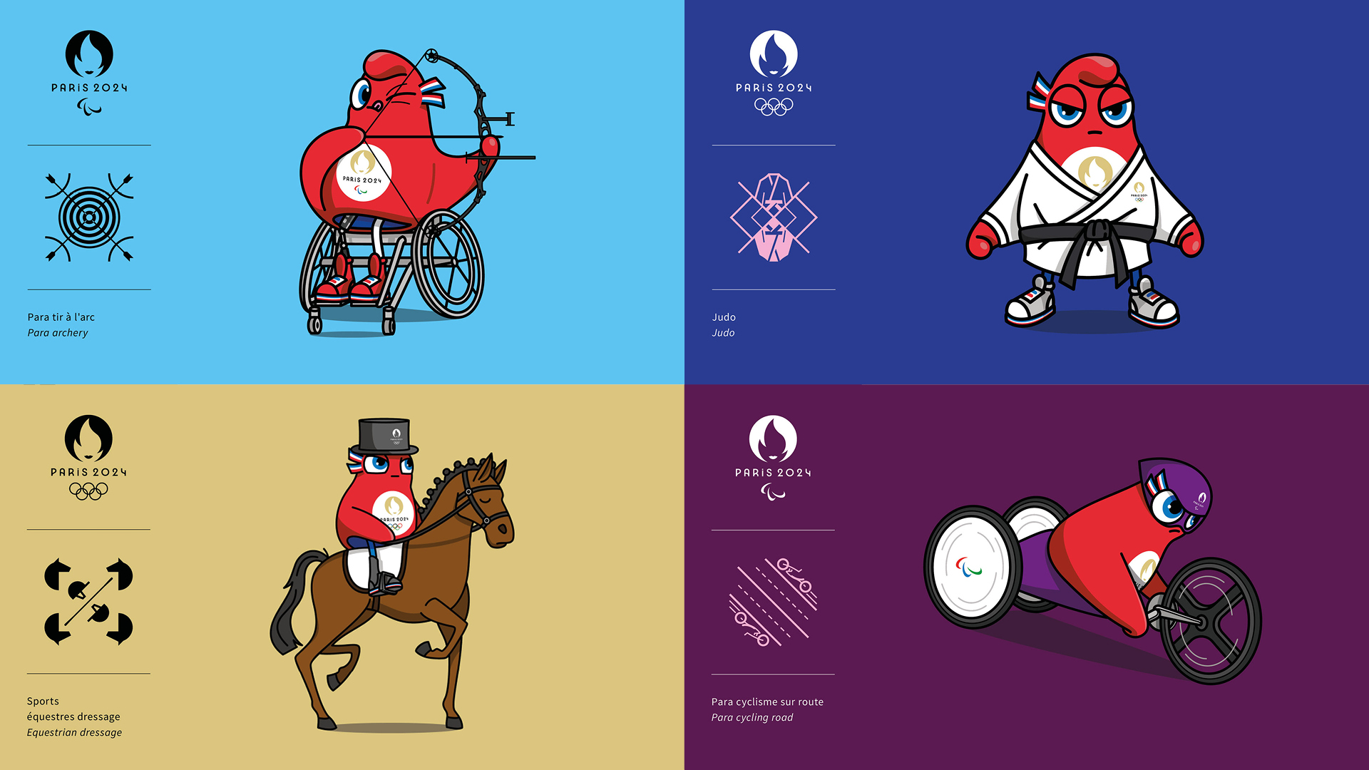
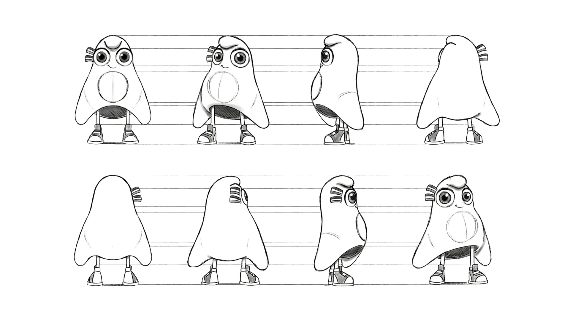
Anaïs: Inclusivity was the focus when it came to creating the mascots. To be frank, we wanted to create the most inclusive mascot ever. With Phryge, we drew inspiration from the Phrygian cap, a symbol of liberty; the mascot motto, ‘Alone we go faster, but together we go further’, echoes the inclusive spirit of the Games and the city itself.
We paid extra attention to creating lovable symbols that yes, have a goofy allure, but also embody the inclusive nature of the Games. The Olympic and Paralympic mascots are two beings of the same breed and are genderless, and we’ve truly showcased disability with the Paralympic version.
As an important revenue streams for the Games, it was a big bet from everyone – but a successful one! The Phryges became a pop icon, winning over even the most snobbish Parisian crowds. The Paralympic version has been selling more than three times as many as previous editions – 30% of sales being before the start of the Paralympic Games, compared to 10% at previous Games.
And if you could do it all again, would you do anything differently?
Gilles: I don’t think so. We were delighted to receive praise for our work (and awards, already) – and it has already sparked interesting and important conversations about disabilities, the French interest in sports, and gender. It has also allowed us to rethink how the world perceives Paris and France more generally.
Anaïs: One thing I’d change – for fewer Parisians to have left Paris. I’ve spoken to lots of friends who fled for a quieter life and definitely regretted it. They missed out on experiencing Paris at its best and on all the action!
This article first appeared in Life at Havas.