AUTHOR: KIERON MOLLOY
READ TIME: 4 MINS
When it comes to reporting, what does ‘accessible design’ really mean? And with ever-more to report on, how does page layout shape the story? Creative Director Kieron Molloy on the trends defining the way reports are designed and structured in 2025.
Twenty-five years ago, when I began working on my very first annual report, the reporting landscape looked a little different. Creative concepts were king, the design tap was switched off well before the Governance section, and the only audience that mattered were shareholders.
Today, a company’s annual report needs to inform, excite and inspire multiple audiences; it’s an opportunity to build trust and showcase the best of your business and brand.
Design has become a key factor in determining whether a report is downloaded, read and shared – or left gathering dust in the (now metaphorical) filing cabinet. With that in mind, here are the design trends shaping the world of reporting today.
1. It’s still about the story – but design has to work harder to tell it
As annual reports regularly hit (and surpass) the 300-page mark, it becomes ever more important to invest in a clear narrative upfront. The first few pages are your shop window – a fleeting opportunity to draw your audience in and give them a compelling reason to read on. Being able to tell your story on a single (or double) page is a prerequisite. Do it well and the design of your opening pages becomes a masterstroke in efficiency and economy of report real estate.
Further into your document, you’ll want to expand and go into more detail – here, using a clearly navigable ‘washing line’ of connected headlines is the way to go. Like a clickable contents page, it allows different audiences to skip straight to the good bit (or the bit that’s most relevant to them).
With Tate & Lyle’s report, integrated signposting and bold dividers bring pace and punctuation; the secondary nav then helps deliver what we’d call ‘capsule storytelling’ – surfacing the messages that Tate & Lyle really want to land and giving time-poor readers a high-level overview of the business’ strategic ambition.
2. The value of page ‘real estate’ remains at a premium
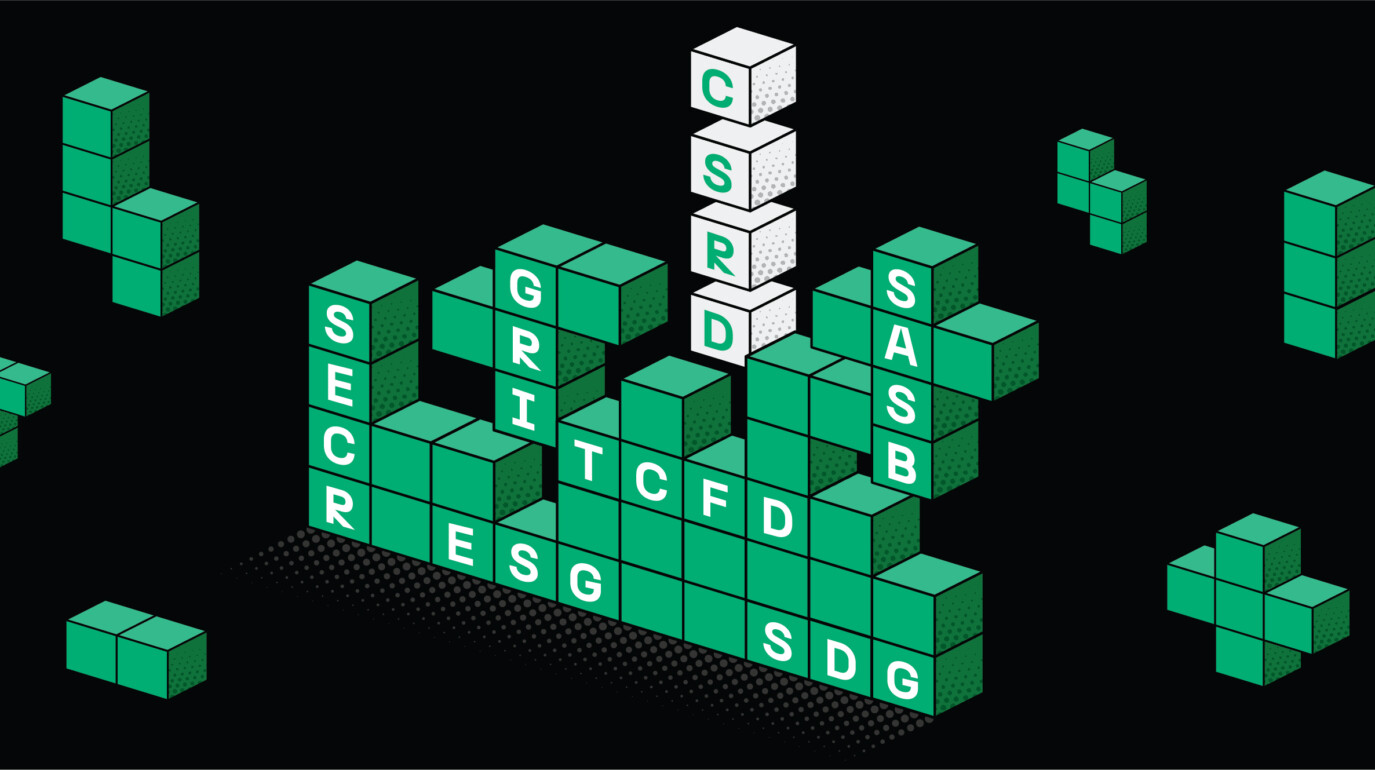
With the recent influx of regulations like TCFD and CSRD, clients don’t have the luxury of simply saying less. As a result, good design becomes all about how we use the grid and inject a much-needed sense of page hierarchy to deliver more information in an engaging, easily understandable way.
Take Tesco, a brand that has always put the customer experience first. With their 2023 annual report, we wanted to give the audience a reading experience that felt as seamless and intuitive as the Tesco weekly shop.
Our design approach took inspiration from the brand’s customer-centric in-store signage; a bespoke grid system and clear typographic hierarchies improved navigation, while messaging focused on customers and the value created for them. The report ended up being one of the shortest strategic reports in the FTSE 100 – with no compromising on depth or detail. No mean feat for a business of Tesco’s size.
3. The move to a more sustainable ‘dark mode’ gathers pace
In the last 12 months, the BBC, BT, Lloyds Group and Money Supermarket all embraced design systems where large swathes of content are ‘reversed out’ with rich, dark colour panels. This isn’t something we’d seen much of before (certainly not in print). Is it being influenced by the wider adoption of ‘dark mode’, combined with the fact that more reports are becoming either screen-first or screen-only? Potentially. It’s worth noting that the above brands all have a customer offering that’s primarily screen focused.
But it does beg a question: is ‘dark mode’ something that all clients should be exploring as a way to be more sustainable? Definitely something to think about.
4. Accessible design is paramount – but it means different things to different people
Nearly every brief that lands on our desks includes a reference to accessibility. But there are degrees to which ‘accessibility’ can be achieved; what was once about point size and colour is now an altogether more complex beast.
If you’re looking for true accessibility, your report shouldn’t include tables or infographics – they’re not readable in Adobe Acrobat so won’t be visible to a visually impaired audience. If you’re talking about accessibility for AI, you’ll need to bear in mind that the same content (tables and infographics) can’t be read by a machine. But if by ‘accessible’ you mean ‘engaging and understandable to the masses’, box outs and infographics are the way to go.
It’s critical that businesses and agencies are clear on their accessibility ambitions from the outset. The degree of ‘accessibility’ needed will have an impact on how a page is designed and constructed – and on timetables and budgets too.
5. Print? There’s life in the old dog yet
While the move to online reporting might feel conclusive, some audiences (and therefore companies) just aren’t ready to let go. And you can see why. A well-designed printed report can be tactile, skimmable and arguably more memorable than its digital counterpart; there’s something lovely about the soft thwack as it lands on a desk, the gleam of a powerful image on the cover.
Aston Martin Lagonda and Rothschild & Co both opt to lead with their physical report alongside the digital equivalent – for them, the printed piece comes into its own without any compromise on the digital experience. Both brands appreciate that the print medium helps convey their premium nature. And it makes sense: when ‘print’ equates to premium finishes and bespoke formats, it’s a great reflection of what it means to be an ultra-luxury brand today.
6. And it wouldn’t be 2025 without a mention of AI…
Like accessibility, questions on how we approach the use of AI are becoming the norm in RFPs. And quite often, the question is asked through a purely financial lens: ‘Are you using it within your processes in a way that can ultimately reduce costs?’
Well, possibly, AI can do that. But its benefit isn’t just about the bottom line. Yes, it can shave off time here and there, but it’s also a tool that can expand our thinking when creating memorable cover themes or get us out of a hole when limited photography assets don’t fit the format. It’s valuable to us throughout the process. And it’s probably best thought of as a way to enhance your product – not just make it cheaper.
Is your report’s design communicating your strategy effectively? Are your key messages landing in the most impactful way possible? Get in touch if you’d like the perspective of our creative team and we’d be happy to talk you through our approach.


